Papa
UX/ UI Design - Mobile Application
Designing the member experience for new enterprise clients.
Overview
This project is about enhancing Papa’s react native mobile app known as the Care app, for our soon to be enrolled new members. The goal of the project is to conduct user research and translate said data in to a new user centered experience for the app.
My Role
Product Designer —
UX Research, User Interviews, Wireframing, UX Design, and UI Design
Company Mission
We all need a pal sometimes. That’s why Papa’s here.
Papa helps health plans and employers connect members and their families to real people for help with companionship, everyday tasks, transportation, and more. It’s vital human connection, right to the front door.
Team
1 Product Manager 1 Design Manager 1 UX Researcher 2 Product Designers (Myself included)
Duration
April 2022 to July 2022 3 Months
Tools
Figma & Zoom

The Problem
The Papa Care app needs to provide an engaging and intuitive mobile app experience for the soon to be enrolled new enterprise members.
The Solution
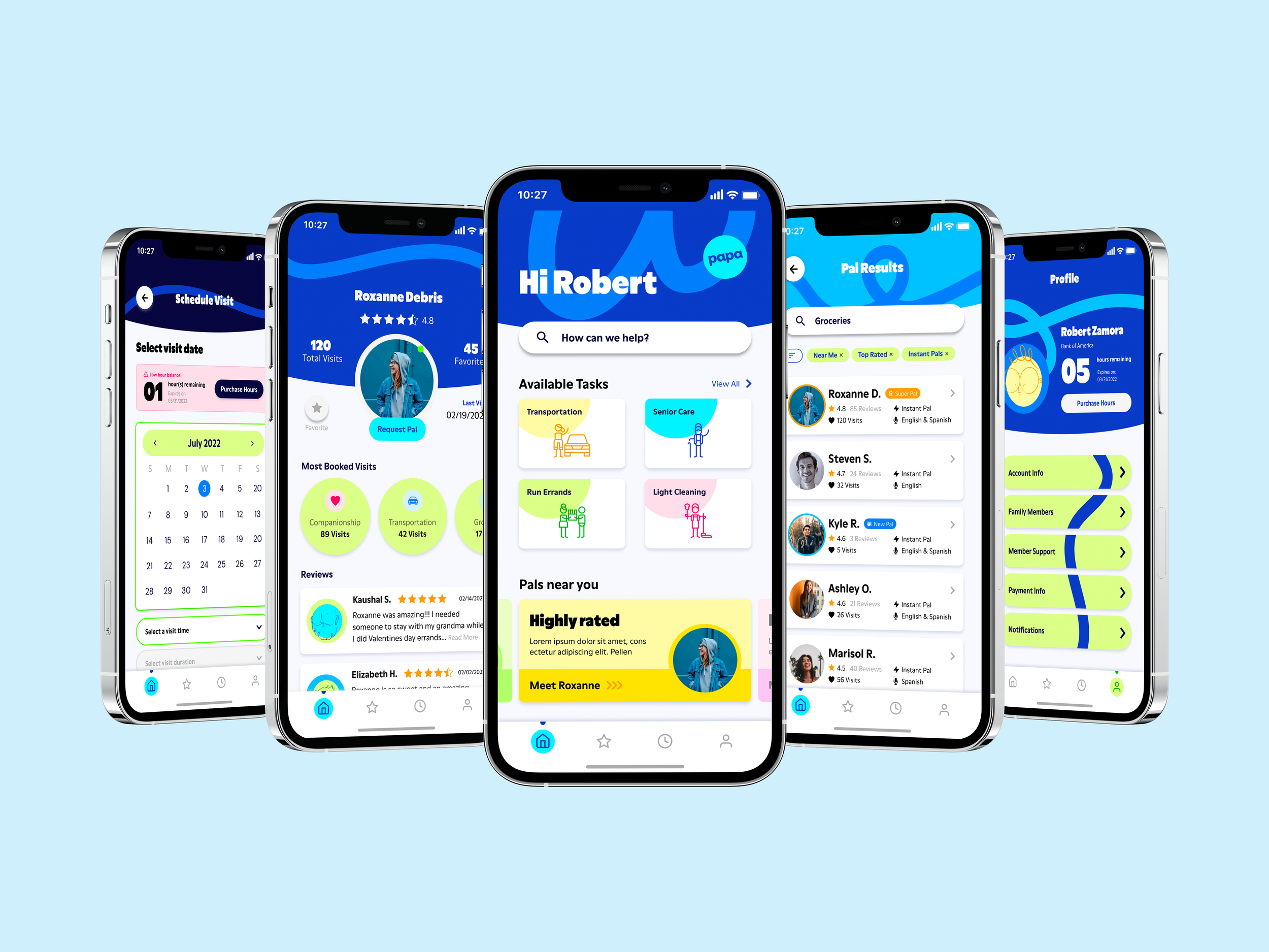
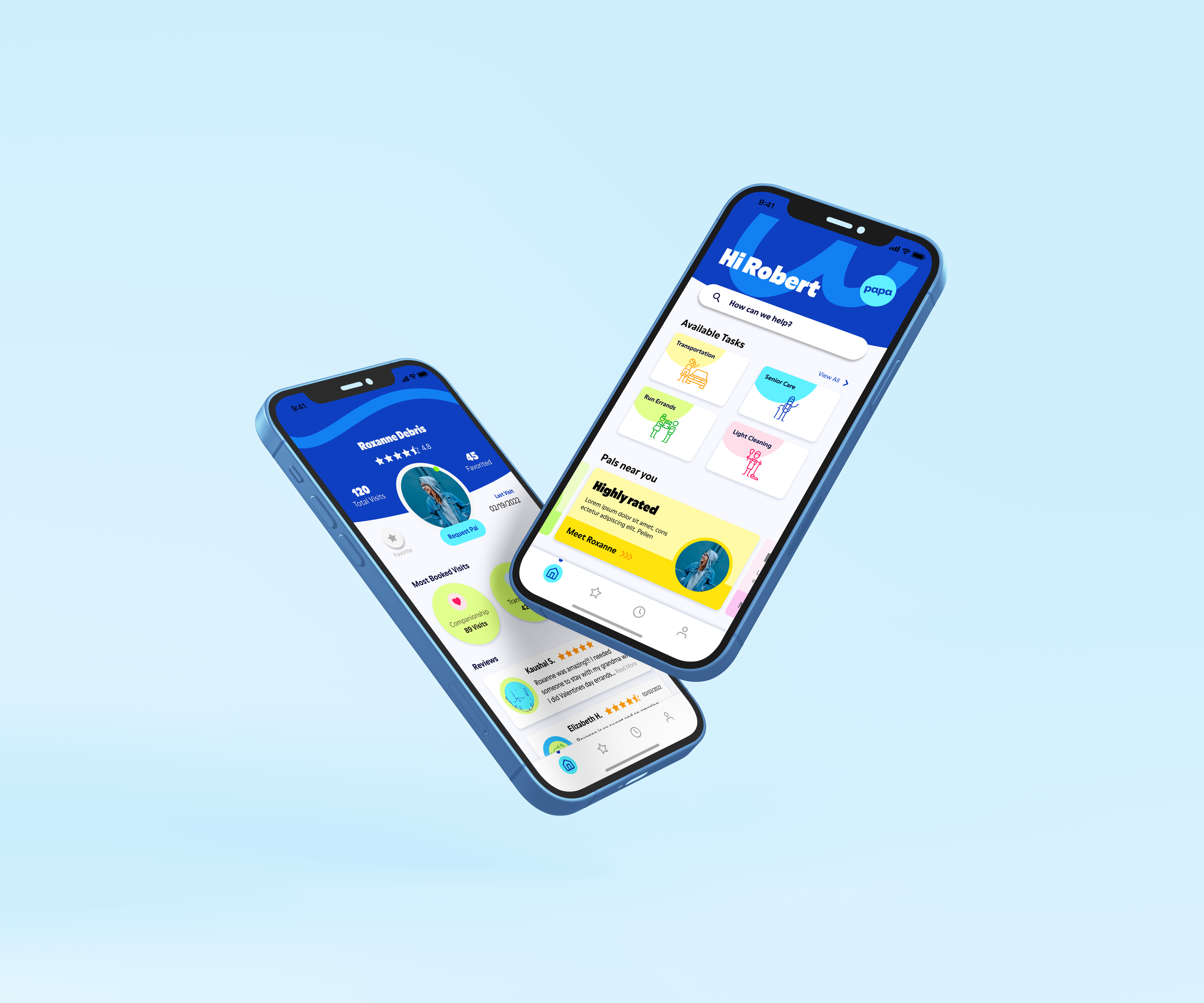
A mobile app that enables users to book visits, search for vetted Pals, craft reviews, and make in-app purchase; while holistically integrating in to the Papa app ecosystem.

Research
Research Prep & Competitor Research
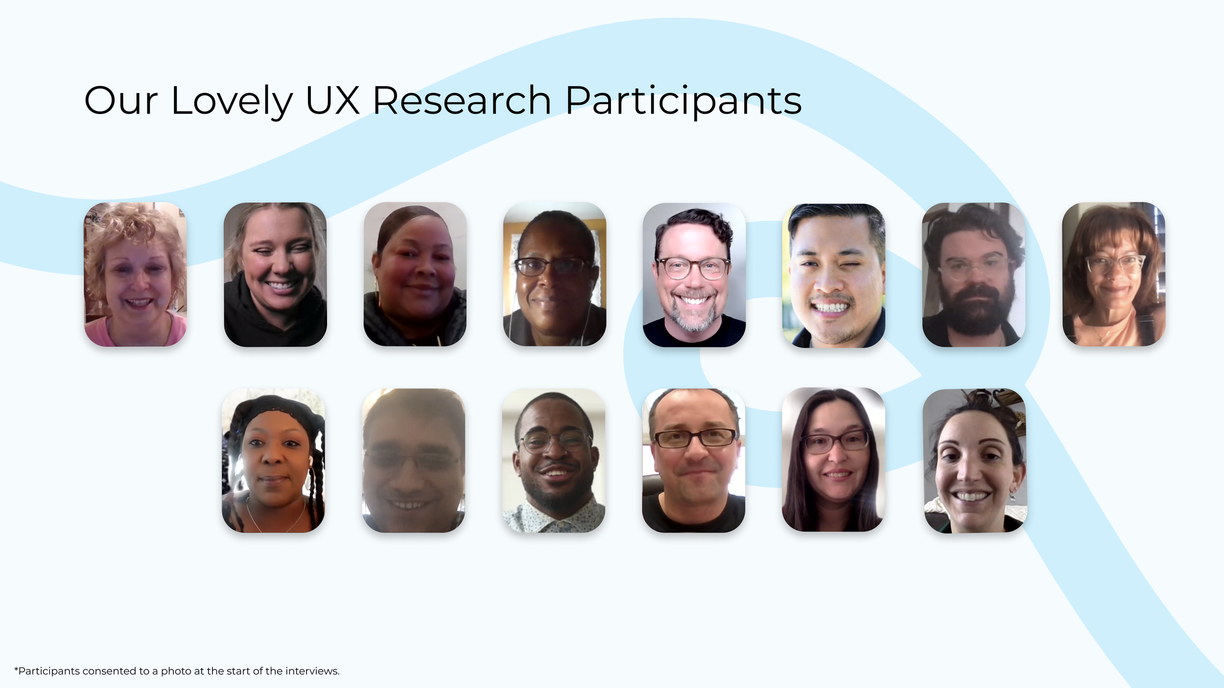
Research began with recruiting volunteers in order to conduct user interviews. The plan was to interview 8 to 16 individuals to in order capture as much qualitative data in as short amount of time as possible. Our UX researcher pulled applicants with use of UserInterviews.com and we were able to sign up 14 total participants.
While our researcher and design manager began crafting the user interview questions and activities myself and my fellow design partner began our competitor analysis of the following gig economy apps:
Task Rabbit
Rover
Instacart
Uber
Lyft
Since Papa’s products involve task based services in the gig-economy, we felt that these were the industry super stars and would provide great direction to be coupled with the qualitative date from the user interviews. We focused on how these companies UX handled scheduling, real-time interactions, search experience, and personal touches.

User Interviews
For the interviews our researcher wanted to find out common pain points in their day to day life as well as, motivations, and goals. Though I did not personally conduct any of the interviews, I did sit in to take notes of the responses and also ask additional questions along the way.
Quote from interview:
“But I want to be able to search pals based on my preferences. Like for my parents, I need somebody who speaks English. I need somebody who's okay with pets. My mother smokes outside. Somebody that's close. I don't want somebody that's two hours away and is always late.”
- Cynthia P.
User Archetypes
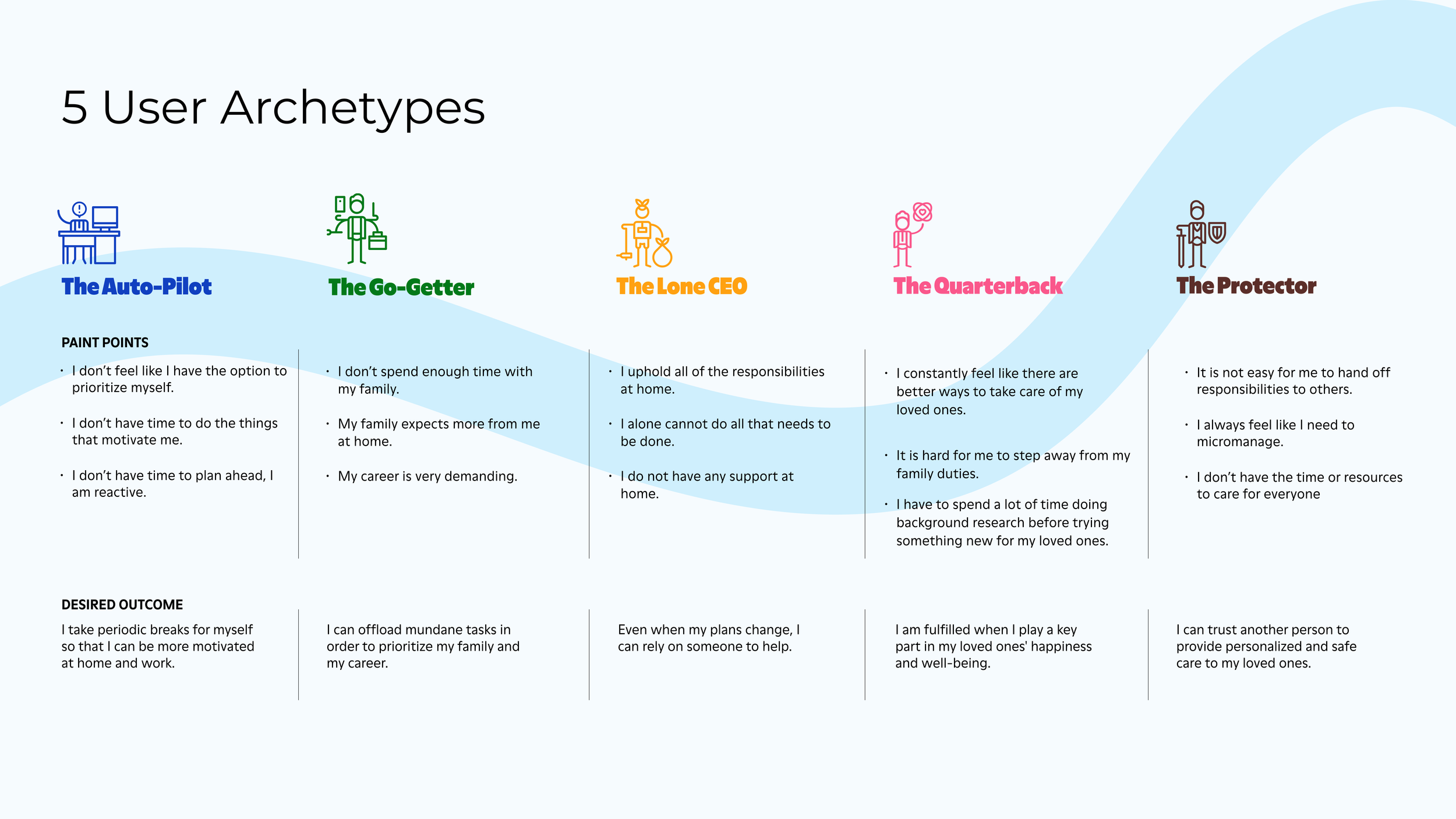
After going through 22 hours of participant interview transcripts and identifying the key insights and themes, our researcher established 5 User Archetypes. Using the archetypes we were able to identified the desired outcomes and common pain points.
These Archetypes will be used help empathize and act as a reference point during the solution/ design phase.

Design
Ideations
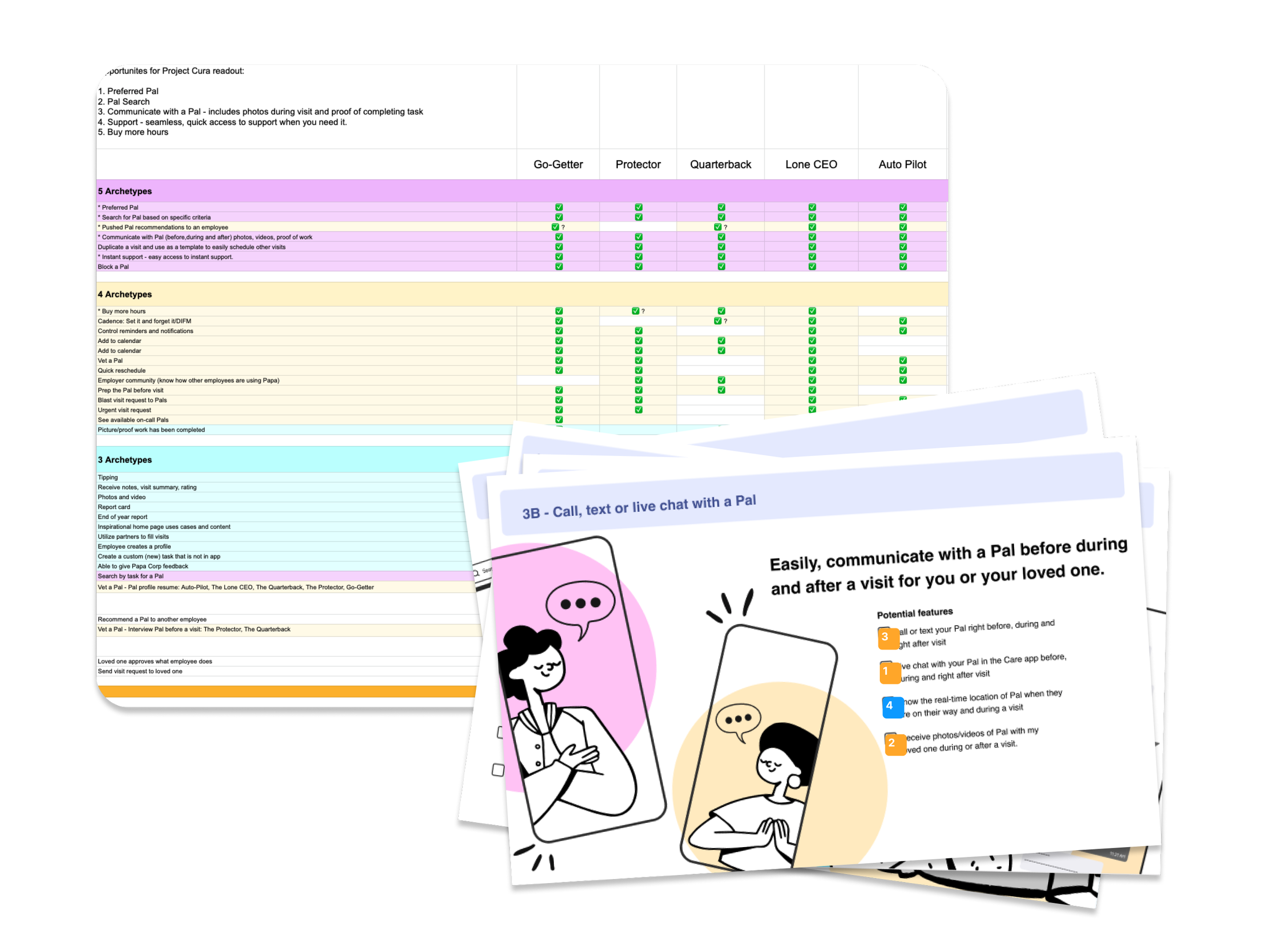
With these core needs, we then conducted couple of classic design exercises and generated key flows and solutions that supported each archetype’s desired outcome and needs. It felt like a breath of fresh to be doing these design exercises in person. Though I love Mirro and FigJam, it’s hard to beat in-person brainstorming and communication. During the weeklong design and research session we generated approx. 160 design ideas and solutions that could be used to in order to achieve the desired outcomes for our archetypes.
With the Archetypes established, research and design got together in person to work together for the ideation process. Once together, research unveiled 5 common needs across all the Archetypes:
Visibility and communication- user want to be able to actually see and communicate with their potential pals for visits.
Find a trusted Pal- users want to be vet their possible pals; they don’t just want a random stranger coming over to their house.
Buy Hours- users are allotted a certain amount of hours at first, and users want the ability to buy once their allotted hours run out.
Use a Pal I know and trust- once the user and pal have established a good relationship, the user wants a way to continue to use that specific pal for more visits.
Seamless support- users want a reliable method to reach support both before, during, and after a visit.

Mid- Fi Wireframes
Once we returned home we began taking all the ideas, research, and archetypes, and putting them in to Figma. It was now time for me and my fellow design partner to craft the user experience in to wireframes. We divided the work by splitting up the top 5 needs of the Archetypes between the two of us. Of which, we decided it would be best to craft 3 iconic screens for each need in order to establish the best MVP for the Care app.
The needs I took on were: Find a Trusted Pal and Buy More Hours; I was also in charge of creating the mini design system for us to use for the full color concepts.

UI Design
For the UI design, we really wanted to showcase our new company branding. However, it since the branding was so new we didn’t have any current system in place. As such, I was tasked with creating a mini design system and styles for us to use and expedite our process.
Once it was ready, my partner and I took our respective wireframes and translated them in full Papa branding with our own interpretation of how it would be applied.
Mini Design System & Branding
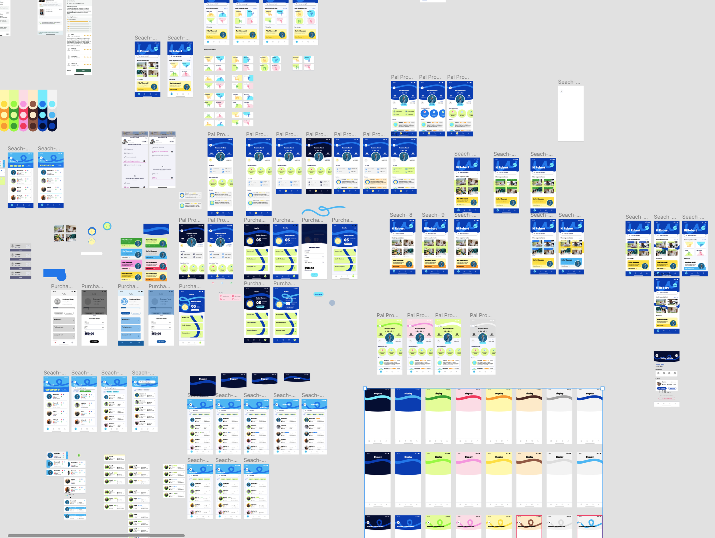
I dove right in to the color application and exploration process. Since the pallet that I’m working with is very vibrant, I felt that nailing this would be the most critical aspect of the UI.Though we had be provided context via a style guide, there was no rule on how to use the colors in the mobile space, so this gave me a lot of creative freedom as well.
It was rather tedious going though all the different color harmonies and applying them to different components, but I loved it! And through various iterations and feedback session I landed on 6 iconic screens that best showcased the two needs I took on.
Iterate, Iterate, Iterate…


Proposal & Implementation
With both the full concept branded and neutral wireframes finished, we passed our work back to our researcher and design manager to prepare for our stakeholder presentation.
The presentation will showcase the full process to our product and VP team in order to influence the direction and eventually implementation for the Care app.


